We’re coming back!
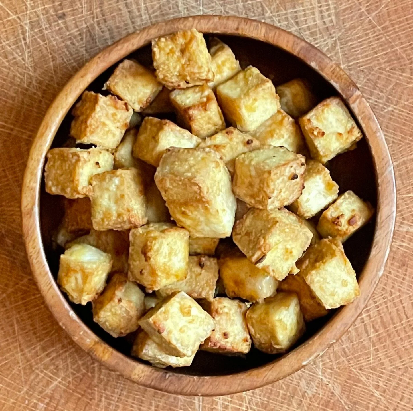
Handmade Tofu & Tempeh
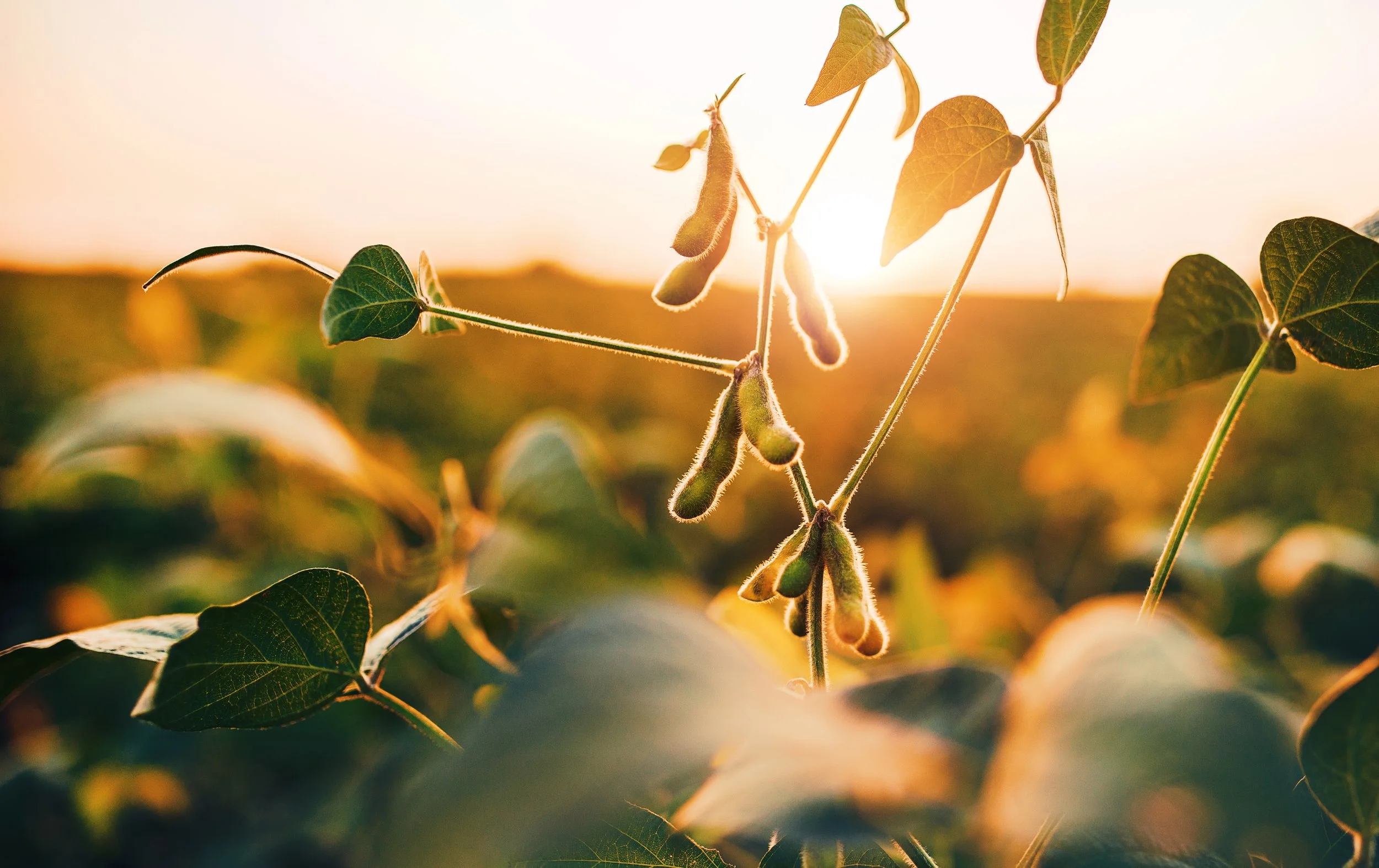
Simple Soyman is located in Milwaukee, Wisconsin and produces fresh, handmade tofu and tempeh using midwest organic, non-GMO soybeans and traditional cooking methods.
The original owners, Barb and RJ, have retired, but will be passing on their knowledge and expertise to the new owner, Jim Neumeyer.
The facility is currently undergoing renovations and production of tofu and tempeh is expected to start in early spring of 2026, followed by some exciting, new products. Stay tuned for updates!